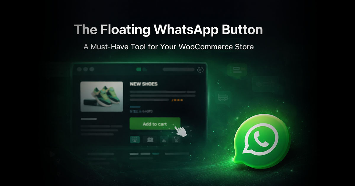
The floating WhatsApp button is one of those things you see everywhere on ecommerce sites and almost never see anyone discuss critically. Stores add it, leave it on, and assume it's working - or at least not hurting. The plugin install page says it boosts inquiries. The WhatsApp-branded promotional material says customers want to reach businesses this way. Both things are true in certain contexts and misleading in others.
The more honest answer to whether the floating button increases inquiries is: it depends on who's visiting your store, what market they're in, where exactly the button sits, and whether anyone is available to respond when someone taps it. Those variables matter as much as the button itself, and most of the content around this topic skips them entirely in favor of a cleaner story.
What the Positive Case Looks Like
There's no shortage of data showing WhatsApp generates more customer engagement than the alternatives. A survey cited by Cooby found that 69% of consumers are more likely to buy from a brand when a WhatsApp option is available. WhatsApp's own research shows that 66% of users have made a purchase after communicating with a brand on the platform. The 98% open rate compared to email's 20–22% is real - messages don't get filtered, don't land in a promotions tab, and are seen almost immediately.
For stores in markets where WhatsApp functions as the primary communication infrastructure - Brazil, India, the Gulf states, large parts of Southeast Asia and Latin America - the floating button resonates in a way that's hard to replicate through any other contact mechanism. A small food company in India tracked by Cooby saw a 5x increase in inquiries after deploying a WhatsApp contact option compared to email. Paragon Technology and Innovation, a beauty brand, integrated a WhatsApp button across their site and social channels and reported handling 10 times more inquiries through the channel than through previous contact methods.
What the UX Research Says - and It's Not All Positive
Here's where the picture gets more complicated, and where most articles about WhatsApp buttons quietly stop reading.
The Baymard Institute, whose large-scale usability testing covers some of the most detailed ecommerce UX research available, has documented consistent problems with floating chat elements. Their finding: sticky chat bubbles that persist across all or most pages are experienced as disruptive, particularly on mobile, where the floating element frequently obscures content the customer is trying to read. The quote from one participant at Lowe's, encountering a live chat bubble: "Oh, god, I hate these, go away." That reaction represents a direct conversion risk on the very pages where you're trying to close a sale.
Nielsen Norman Group's research on chat UX found that participants on Dell's mobile site completely ignored a floating chat button placed on the left side of the screen, navigating to the Contact page instead because the button's position was unexpected. On Forever 21's site, a floating chat button was ignored entirely because it was too small. NN Group's conclusion: two of the most common reasons floating buttons get ignored are wrong positioning (anything other than bottom-right corner) and insufficient visual contrast with the page.
Baymard's overall takeaway isn't that floating chat elements are bad, but that they're often implemented at the wrong scope - sitewide when they should be page-specific, and without accounting for mobile obstruction.
The Market Variable That Overrides Most Other Factors
All of this UX research applies more strongly to some markets than others, and that distinction matters more than any button configuration detail.
In Brazil, where WhatsApp penetration among smartphone users runs above 95%, a floating WhatsApp button on an ecommerce store reads as a standard, expected contact mechanism. Customers aren't experiencing a novel interface element - they're seeing an invitation to communicate through the channel they already use for everything else. The UX friction that Baymard documented in US ecommerce testing is genuinely lower in these markets because recognition is instant and the behavioral pattern is already established.
In the US and Western Europe, the picture is different. WhatsApp's penetration in the US sits at around 34% of smartphone users, and many of those users don't use it as a primary channel for business contact. A floating WhatsApp button that goes unrecognized performs much closer to what Baymard's research describes.
Where on the Page the Button Lives Matters More Than Most People Realize
The conventional default for floating buttons is bottom-right corner, and there's a good reason for it: it's where users have learned to expect them. Nielsen Norman Group's research confirms that departing from this position significantly reduces discovery and use.
Size is the second variable. A button small enough to avoid disrupting the layout is often small enough to be ignored, particularly on mobile. Getting this balance right requires actually testing the button at your specific product pages on actual phone screens - not just checking the desktop view in a browser window.
The third variable is which pages the button appears on. Here's where most stores make the mistake that the UX research most clearly flags: enabling the floating button sitewide, including on pages where no purchase decision is being made. A floating WhatsApp button on a blog post, on an about page, or on a category archive page is a persistent distraction with essentially no upside. Limiting the button to product pages, cart, and checkout removes the noise without reducing the reach.
Most WhatsApp plugins for WooCommerce support page-level visibility controls. ChatCart Pro includes a floating button with configurable position, message, and page-level visibility controls - you can restrict it to specific page types and configure exactly which pages it appears on. Click to Chat also supports restricting the floating button to specific page types or individual page IDs. This configuration step takes about five minutes and makes a real difference in the ratio of useful impressions to irrelevant ones.
The Response Time Variable - and Why It Can Flip the Outcome
A floating WhatsApp button that generates inquiries no one answers in time is worse than no button at all. Not because it actively drives customers away, but because it creates an expectation of immediacy that WhatsApp has trained users to expect - and then doesn't deliver on it.
Gallabox's research on response timing found that companies responding within the first 15 minutes see up to 80% higher conversion rates than those responding later. The floating button surfaces at every scroll, on every product page, throughout the customer's session. When a customer taps it, they're doing so because something on that page generated a question. If the response comes six hours later, the moment has passed.
WhatsApp Business handles this somewhat with automated greeting messages and away message settings - you can configure a response that goes out immediately acknowledging the message and sets an honest expectation for when a real reply will come. Stores that don't configure these automated responses, and then aren't available to reply in real time, are leaving the channel in a state where it generates inquiries it can't service properly.
The Floating Button vs. the Inline Product Page Button
There's a distinction worth drawing between the floating button and an inline WhatsApp button placed in a specific position on the product page.
The inline product page button has inherent advantages from a UX perspective: it appears in a fixed, expected location within the product layout, adjacent to the add-to-cart area where the purchase decision is being made. It doesn't follow the customer around. It doesn't obstruct content on other pages. For most WooCommerce stores, the inline product page button is the higher-priority implementation.
The floating button adds incremental reach - catching customers who are on the cart or checkout page and didn't encounter the product page button - but it's supplementary to the inline placement rather than a replacement for it. Stores that enable only the floating button, without an inline product page button, are taking the version with more UX risk (sitewide persistence, mobile obstruction potential) while missing the version with more conversion upside (positioned precisely where purchase decisions are made).
Related: How to Add a WhatsApp Button to Your WooCommerce Product Page (No Code Required) - the full setup guide for inline product page buttons, including number format, pre-filled messages, and placement options.
A Practical Framework for Deciding Whether to Use It
Given all of this, the decision isn't really "does the floating WhatsApp button work" in the abstract. It's a short checklist applied to a specific store:
- What market is most of my traffic from? High WhatsApp penetration (Brazil, India, GCC, Southeast Asia, most of LATAM) - strong case for the button. Predominantly US or UK - moderate case, worth testing, probably more important on mobile than desktop.
- Is my product category one where customers commonly have pre-purchase questions? Fashion, beauty, custom products, complex specifications, higher price points - yes. Commodity items, well-documented products, low average order values - less compelling.
- Can I respond to WhatsApp inquiries within 15 minutes during business hours? If yes, the button creates a channel worth having. If not, at minimum configure an automated greeting that sets expectations.
- Am I willing to scope the button to relevant pages rather than the whole site? Product pages, cart, checkout - yes. Blog, about, archive pages - no.
- Is the button positioned bottom-right and large enough to be noticed? Check on actual mobile screens, not browser developer tools simulation.
The Actual Answer to the Title Question
In markets and contexts where it's well-matched, yes - a floating WhatsApp button increases store inquiries, often meaningfully. The data from WhatsApp-native markets is consistent enough that the question in those contexts isn't really whether to have the button but whether the store can handle the inquiry volume it generates.
In markets where WhatsApp is a minority channel and the product doesn't create natural pre-purchase questions, the button tends to generate low inquiry volume, and the more relevant question is whether the UX cost outweighs the modest benefit. For those stores, the inline product page button is the better bet.
The thing that most stores skip - and that consistently determines whether the button is an asset or an afterthought - is the response infrastructure behind it. A well-positioned button with fast, helpful responses will reliably convert inquiries into sales. The same button attached to a WhatsApp number that responds tomorrow won't. The button is the surface. What's behind it is the product.
ChatCart Pro includes both an inline product page button and a configurable floating button - with page-level visibility controls, per-category routing, and a built-in analytics dashboard to track which placement drives the most conversions.
Also read: Why WooCommerce Customers Abandon Checkout - And How WhatsApp Brings Them Back - how a well-configured WhatsApp channel prevents abandonment before it happens, rather than just recovering it after.